Mummyhood after Adland

I LOVE doing illustrations for personal blogs and small online businesses. From the early days of Wardrobe Mistress a few years ago, to So Many Lovely Things recently, and quite a few interesting projects in between, it will always be one of my favourite things to do! It’s fun and the result is immediate: after you deliver the artwork, you’ll see it live a few days later, probably sooner. In a few hours, perhaps! – This is definitely one of the benefits of being an illustrator nowadays: instant reward.

Anyway, this is the header I illustrated for From E to ABC.

From E to ABC_header

For those who don’t know, “E” refers to e: A Novel, by Matt Beaumont, about the everyday life of an advertising agency.

Like me, the blogger, Mrs W used to work in advertising. In fact, we started our careers together as graduates in the same agency in London! I quickly realised that she was bright (exceedingly so!) and hilarious, so we became very good friends.

Her blog is about her journey from the Ad world to motherhood, and she tells it like it is, in her very own brilliant way.

From E to ABC Blog_01 From E to ABC Blog_02

Judging by this header, you can tell that I am going through an objects phase, right? Anyone who knows me or my work, knows that I love drawing girls. (Girls, girls, girls, always girls!) I still do, of course, but I am trying a couple of different things at the moment. Mainly objects and patterns. I’ll post them here very soon!

Read From E to ABC: Mummyhood after Adland here.

Lots of love

signature for blog


Maystagram

Oh my God, is it June already? I can’t believe it. Slow down, 2014! You’re making me dizzy!

May was a beautiful month.

The ground looked like this:

May_01 May_02

I saw the Jean Paul Gaultier exhibition at the Barbican Centre in London.

May_09 May_10 May_11 Processed with VSCOcam with f2 preset Yes, this was one of the corsets he designed for Madonna’s Express Yourself performance (Blonde Ambition Tour , 1990). You know… when she used to be cool. – Watch here.May_13

I visited Chatsworth in Derbyshire. Or Pemberley for the Jane Austen fans out there. It was GORGEOUS, as I knew it would be. Mr. Darcy has exceedingly good taste. :0)

May_03 pemberley images_01 pemberley images_02 May_08

And I did lots and lots of illustrations. I worked on a number of private commissions and I am currently working on my second children’s book. More about that soon, I promise.

Processed with VSCOcam with g3 preset

So long, May! So long, Spring. It was a pleasure.

Hello, June. Hello summer. Please come on in. Make yourself at home…


Illustrated Wedding stationery – part V

Instead of numbering our tables, we decided to name them, using the names of places that had a meaning for us. Most of them were cities where we’ve been on holiday together, others were places where we each lived individually and a couple were private jokes for specific guests. I overheard a friend saying “I’m in Marrakech! I love it there!”, so I think it was more fun and personal than just using plain numbers.

I wanted our seating plan to be as clear a possible so our guests could quickly spot their names and their tables. I opted for a nice, clean font and then added the little hand drawn hearts later.

Table Plan_02 Table Plan_03 Table Plan_04 Table Plan_05 Table Plan_06 Table Plan_07 Table Plan_08 Table Plan_09 Table Plan_10 Table Plan_11 Table Plan_12 Table Plan_13 Table Plan_14 Table Plan_15 photo at the wedding_02

That’s all from my wedding stationery project. It was rewarding, fun and of course, very special to me. You can see the complete collection on my website, here.

If you would like me to create custom illustrated wedding stationery for you, please do get in touch here! We’ll make it 100% personal and unique, to reflect your taste and personality. :0)

Illustrated Wedding stationery – part IV

The best thing about designing your own wedding stationery is that you can do pretty much whatever you want! The menus were my favorite part.

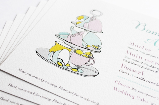
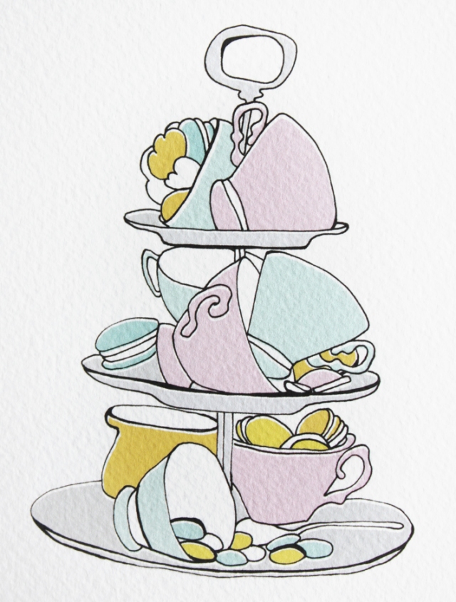
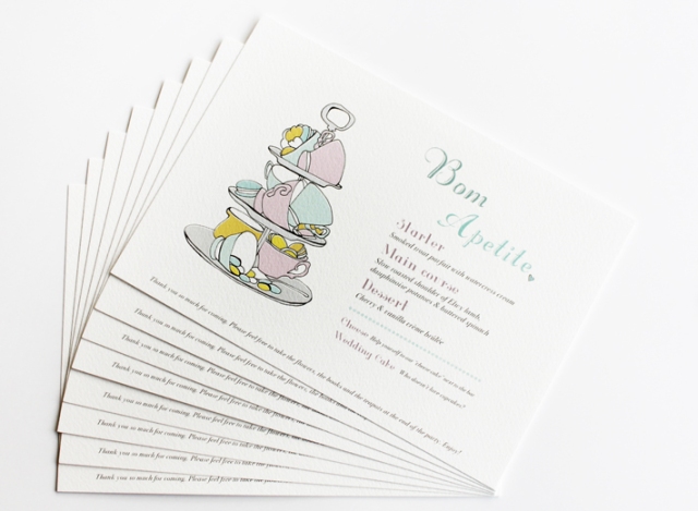
I looked at LOTS of references (thank you, Pinterest!) and experimented with a few ideas. Some were very detailed and complicated, others were simpler. In the end, I opted for a minimalistic design with a little hand drawn illustration as a focal point:

“Bom Apetite” is the Portuguese version of “Bon Appétit”. Portuguese is similar to French in many ways.menu_03 menu_05_B menu_06_BIMG_1485

Similar to our invitations, the paper was very important to me. I wanted beautiful, good quality paper with a nice texture and a particular thickness. To be honest, paper is ALWAYS important. It makes all the difference. In our case, the texture made the illustration ‘pop’ a little, even though I used delicate tones.

I wasn’t at all worried about following a strict color scheme, but the soft palette of the menus went really well with the tones of the room. I think our guests liked the menus too. There were very few left on the tables at the end of the evening, which I was told, was a good sign. :0)

Wedding photo Image by our official Photographer

The last part of our wedding stationery were our table names (yes, names, not numbers!) and the seating plan. I’ll post them here tomorrow. Stay tuned.


Illustrated Wedding stationery – part III

When I designed our wedding stationery, I thought it would be a good idea to include some practical information about our venue, as well as a map of the area. This is not exactly necessary, as everyone can access google maps on their smartphones, but I thought it would be a nice, personal touch.

This is what it looked like in the end:

Map_01Map_03 Map_02  Map_04 Map_05

Even if it wasn’t exactly essential, adding a map saved me from having to explain to everyone how to get to our venue and repeat myself over and over again, which would have been inevitable. So in a sense it made life a lot easier… for ME! :0)

After the Save the Date cards, the invitations and the maps, what came next? – The best part: the menus and table plans! The menus were definitely my favourite piece of stationery. I’ll post them here tomorrow. Stay tuned.