Illustrated Wedding stationery – part IV

The best thing about designing your own wedding stationery is that you can do pretty much whatever you want! The menus were my favorite part.

I looked at LOTS of references (thank you, Pinterest!) and experimented with a few ideas. Some were very detailed and complicated, others were simpler. In the end, I opted for a minimalistic design with a little hand drawn illustration as a focal point:

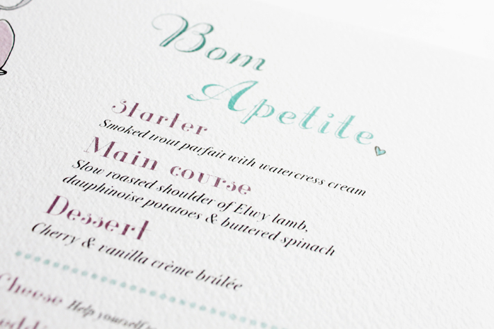
“Bom Apetite” is the Portuguese version of “Bon Appétit”. Portuguese is similar to French in many ways.menu_03 menu_05_B menu_06_BIMG_1485

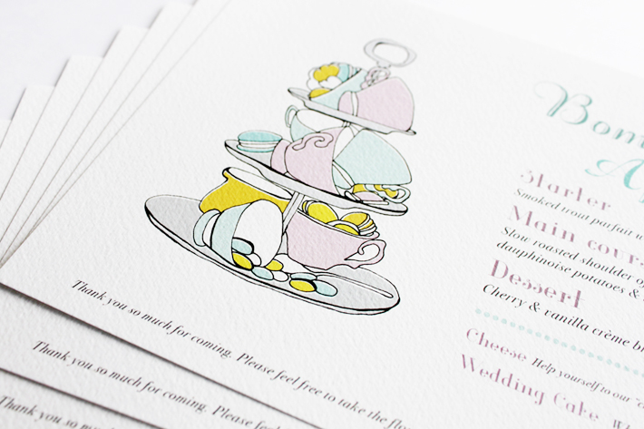
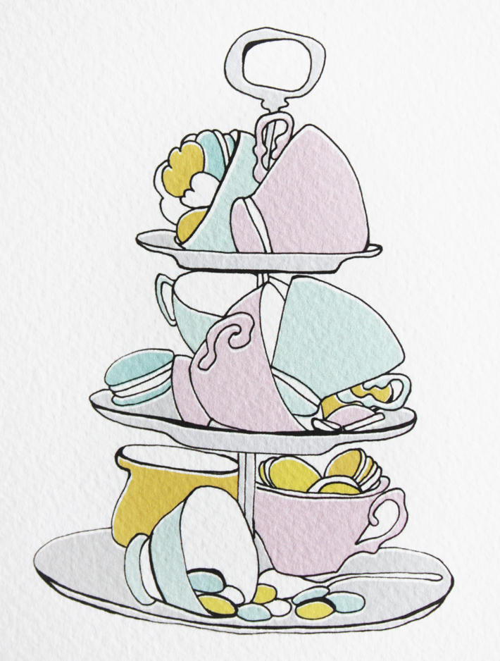
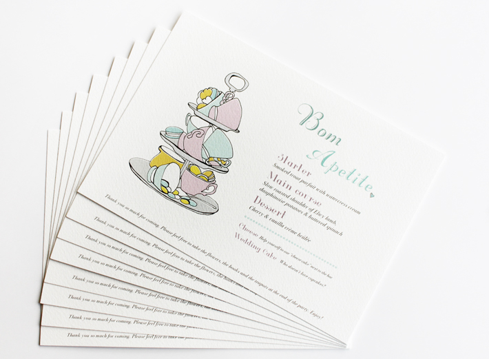
Similar to our invitations, the paper was very important to me. I wanted beautiful, good quality paper with a nice texture and a particular thickness. To be honest, paper is ALWAYS important. It makes all the difference. In our case, the texture made the illustration ‘pop’ a little, even though I used delicate tones.

I wasn’t at all worried about following a strict color scheme, but the soft palette of the menus went really well with the tones of the room. I think our guests liked the menus too. There were very few left on the tables at the end of the evening, which I was told, was a good sign. :0)

Wedding photo Image by our official Photographer

The last part of our wedding stationery were our table names (yes, names, not numbers!) and the seating plan. I’ll post them here tomorrow. Stay tuned.


Illustrated Wedding stationery – part III

When I designed our wedding stationery, I thought it would be a good idea to include some practical information about our venue, as well as a map of the area. This is not exactly necessary, as everyone can access google maps on their smartphones, but I thought it would be a nice, personal touch.

This is what it looked like in the end:

Map_01Map_03 Map_02  Map_04 Map_05

Even if it wasn’t exactly essential, adding a map saved me from having to explain to everyone how to get to our venue and repeat myself over and over again, which would have been inevitable. So in a sense it made life a lot easier… for ME! :0)

After the Save the Date cards, the invitations and the maps, what came next? – The best part: the menus and table plans! The menus were definitely my favourite piece of stationery. I’ll post them here tomorrow. Stay tuned.

Illustrated Wedding stationery – part II

A few months ago I designed all the stationery for my wedding. I had illustrated a couple of wedding invitations before (see here), but this time, it was my own, which was extra sweet. :0)

We had a London wedding and as we had lots of foreign guests (my part of the guest list alone was a crazy mixture of people coming from Brazil, Portugal, Spain, Germany, Switzerland, Sweden, France and the US!), I decided to design a very informal invitation and have a little bit of fun with the illustrations.

Invitation_01 Invitation_02 Invitation_03 Invitation_04 Invitation_05 Invitation_06 Invitation_07 Invitation_08 Invitation_09 Invitation_10 Invitation_11

The feedback we received was great, which made me so happy.

A lot of my friends are in the creative industries and know that I am not a traditional person at all. So I expected that they would get a little kick out of the drawings. I was a bit worried about our older guests though: our grandparents, uncles and aunts. But everybody loved our invitations! I guess people are a little bored of the traditional formats with the long texts and serious colors. I guess they found it refreshing to see something different, with a bit of humor.

In the end, I just wanted to make everyone look forward to their trip to London. They were flying such long way to be there, I wanted them to be as excited as I was.

I also designed a map with information about our venue. Drawing a map was a little more challenging than I had anticipated. Especially because I was so worried that my guests would get lost around central London! Luckily, it all worked out in the end. The map was clear and no one got lost. I will post it here next. Stay tuned.


Illustrated Wedding stationery – part I

>> Save the Date cards

Recently I illustrated and designed my own wedding stationery.

These were our Save the Date cards:

Save the date_01 Save the date_02 Save the date_03

Save the date_04 Save the date_05 Save the date_06 Save the date_07

I love hand drawn typography and I wanted to keep things soft and simple: just a hint of color, a couple of cute details here and there, and very good quality paper. I am also CRAZY about washitape. The one I used here was from Paperchase. I fell in love with the pattern.

Tomorrow I’ll post our official invitations. Our wedding was in London so needless to say, I had a little bit of fun with the illustrations… ;0)

Stay tuned.

Tea time in London

I LOVE doing private commissions. I know a lot of illustrators don’t like doing them or just don’t have the time, which I think is a shame. Depending on the client, private commissions can be freeing and a lot of fun.

I was commissioned by a lovely client to produce a special illustration for her daughter. The details: she loves London, she likes wearing blue and she is crazy about squirrels. How adorable is that? This is the final piece:

The Londoner_blog

If you would like to commission a piece, get in touch! Personal illustrations are popular, thoughtful and make the BEST gifts. It’s one of my favorite things to do.